Responsibility of a Tone

There are hundreds of tones had been discovered. But, only few photographers could explain about tones. The answers I often get from them are just about favorite tones. Because a photographer loves a tone, the same use it. This kind of reason is not wrong, because there’s no certain measure of toning in arts (especially functional design and photography,) only the fittest is right (this includes taste in arts.)

Actually, editing or changing tones is not as easy as pie, because the process involves knowledge.

One of the knowledge to dissect the meaning of a tone is psychology (logos means knowledge, psyche means soul.) This could be seen on common people (not artists) when responding to a photo, “This is dramatic!” or the like. And no wonder, this is the reason my friend took an art therapy graduate program. Art therapy uses the arts (especially visual arts) to educate the future generation, and it could be used to heal mental problems. The elements used in such activities are the elements of the arts (points, lines, vertices, color, etc.)

There are more ‘surgical knife’ or fields of knowledge that makes a tone meaningful, like geography, semiotics, hermeneutics et cetera. Thus, a photographer should be held responsible for his/her use of tone from various views of knowledge.

So there, people.
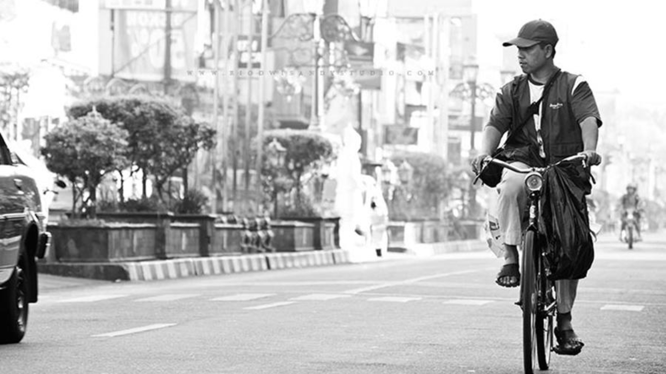
A man cycling on the street, daytime

Marketplace is Crowded

Taking a refreshment by tracing the streets of Denpasar is the things I like to do after working in long time. Seeing shops and businesses in my left and my right. When I was in a peculiar street by the name of Teuku Umar St., I thought over the signs and ad-boards across it. One store even put three large ad-boards!

There is… practically nothing to limit such things. The owner has the rights for it. But, I’d love to advise business owners like that mentioned above, but if you won’t follow such advice, it would be no problem for you. One advice I’d like to tell you is about difference.

Some tutors once advised me, “If you’re about to start a business, find something different.” This principle is my basic thoughts in making an advertisement, signs or even marketing scheme. The aim of difference is to make people see it and get interested by it. Then, questions arose on that discussion, “Example of such difference?”

Many difference I found around me. Maybe when you walk across Jakarta, you’ll see such differences, but in cities like Denpasar, it’s few. There’s some examples of it in marketing, I’ll show you.

Repetition

This functions as a pattern-maker in your mind. This repetitive pattern weaves opinions in your mind to make you remember it.

Digital (visual technology)

Singapore has a realistic-looking fountain made with 3D animation that can change colors. This is an example of digital medium as a difference.

Content materials (character, plot, tagline, visual techniques etc.)

So many ads are pushed into people, like “I like Monday” (among the society which hates Monday,) and “Fun together” and many more that could catch someone’s mind.

And there’s many things on “difference”. It needs deep thought to make it, but maybe, it’s not impossible.

Difference means interest.

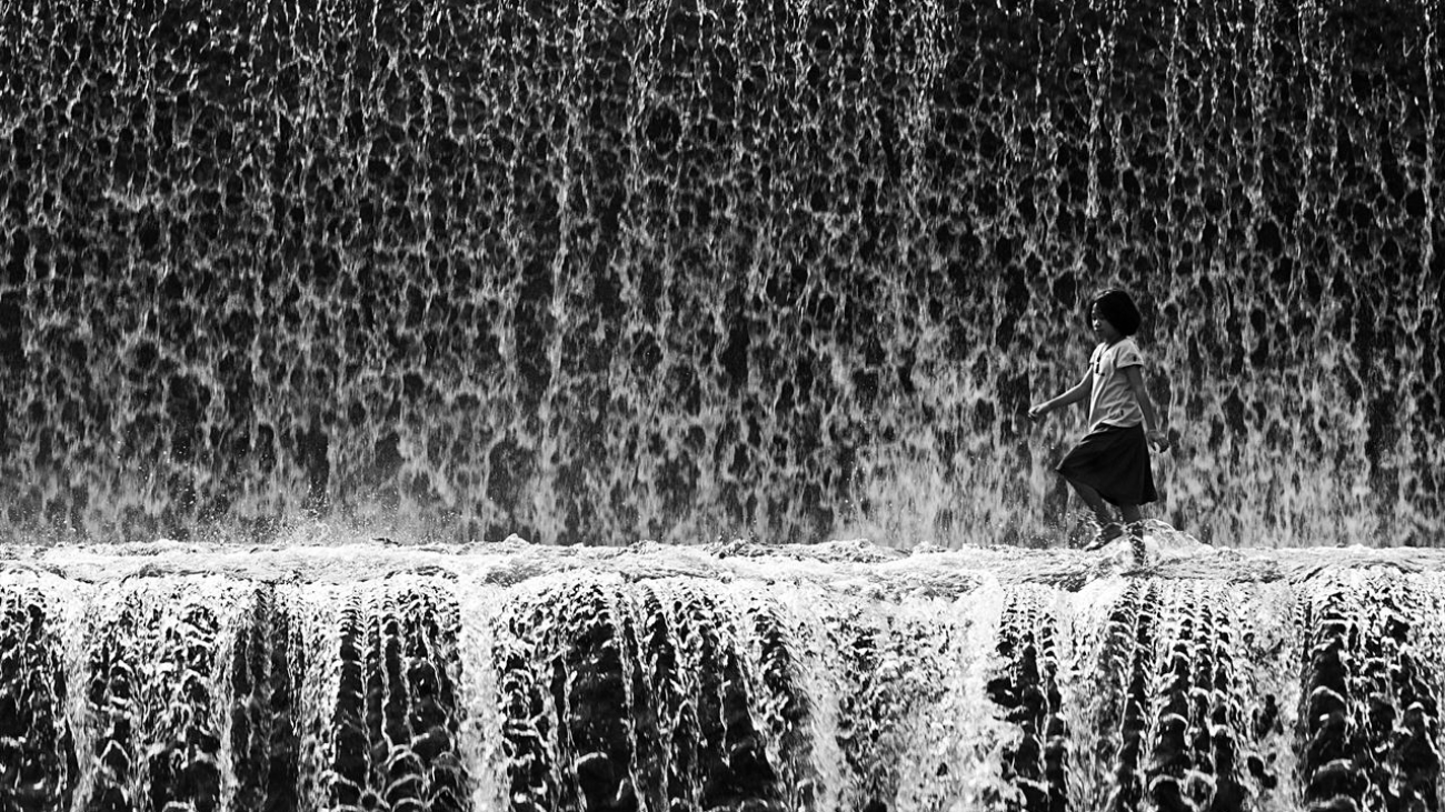
A child walking in the midst of waterfall.

The Sensation of Grayscale

Color is a visual experience depending on lights: if there’s no light, then no color. Certain literatures say that black is not a color, but something’s wrong with that statement. Actually, black is a color… a color without hue. So are white and gray; they just have different luminosity: thus these are achromatic colors. In the realm of photography, it means recording dimension of colored lights into white, grays or black. The ability of someone to visualize a photographic work influences the positioning of those achromatic colors.

It was very hard for me to understand grayscale photos, in my first years of learning photography. For me they gave no chilling sensations.

And few years passed away, carrying experiences for me, I finally got into boredom of chromas, and trying to find another sensations. Then finally, I explored grayscale photography: editing images into grayscale and comparing them to the colored ones. In my exploration on grayscale, I found a different sensation in it-like mentioned before-the sensation of transition from chromatic to achromatic. I found that hue determines the image’s gradients, for example: reds made into grayscale will differ to blues made into grayscale. Many times, photographers don’t realize such things: only know grayscale visually, but don’t get into the basics of its process and its history. And in a transition, we must consider levels of light in grayscale images.

There’s more things I get from the experiences of grayscale photos, like achromatic notation, types of achromatic and more and more and more and—yup, it will be too long if I talked too much about it.

So, final conclusion: enjoy the world… in grayscale! And may this will please you.

With warm greetings,
Rio Dwisandy.

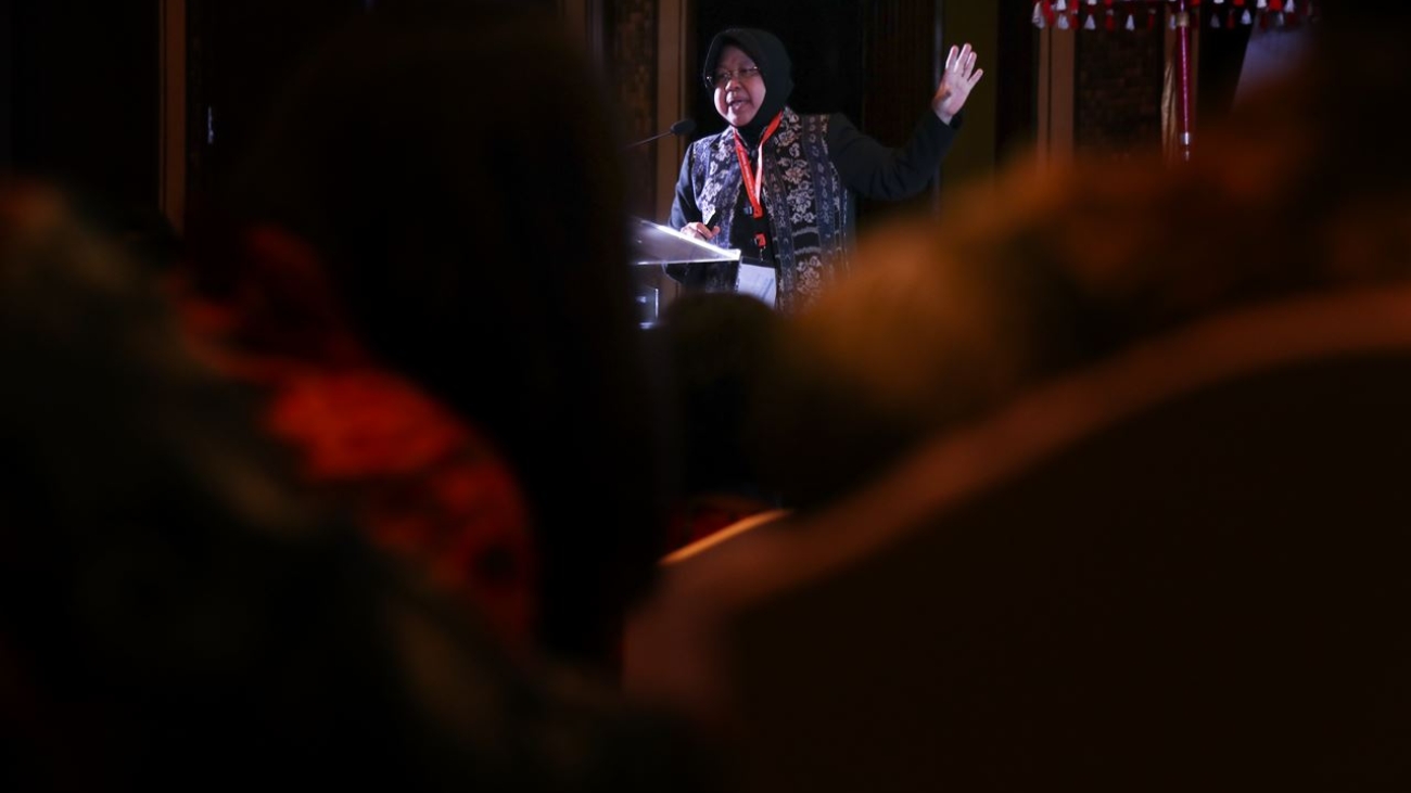
Tri Rismaharini

General Affairs Forum

General Affairs Forum (GAF) 2018 is the third General Affairs Forum event held by SKK Migas and PAMFI in Indonesia. The event was held in Inaya Putri Bali, Nusa Dua, Bali on August 30th-31st, and this is the first time GAF to involve industries not from upstream oil and gas industries, like Bank Mandiri and Garuda Indonesia Airlines. Its speakers includes Tri Rismaharini (Surabaya city mayor) and Krishna Murti (Head of International Missions Bureau, Indonesia National Police.) This event intended to show synergy between oil companies, banks and even food resources company. We’re commissioned by SKK Migas to document this event.

[metaslider id=6393]